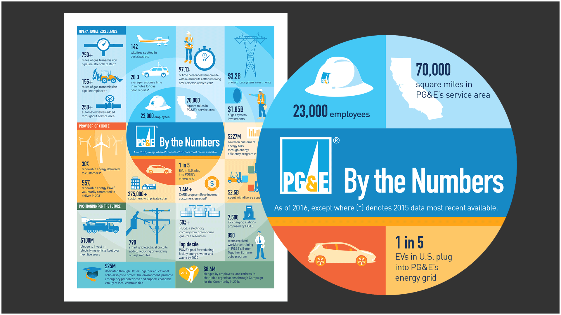
 PG&E By the Numbers.
 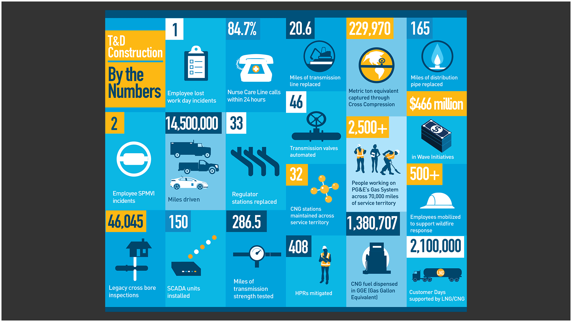 PG&E Gas T&D Construction: By the Numbers.
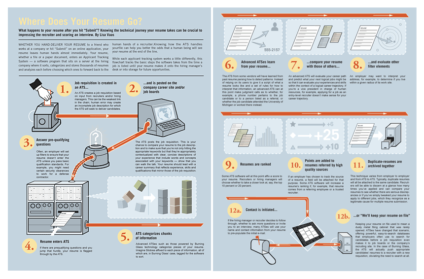
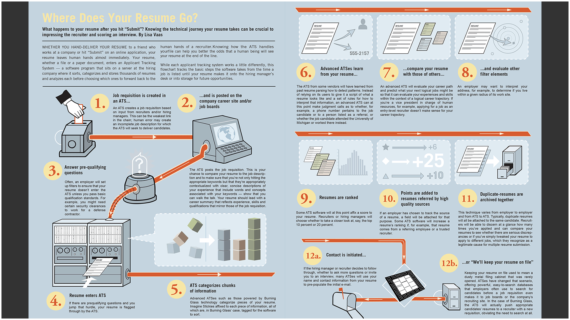 Where Does Your Resume Go? The Ladders newsletter.
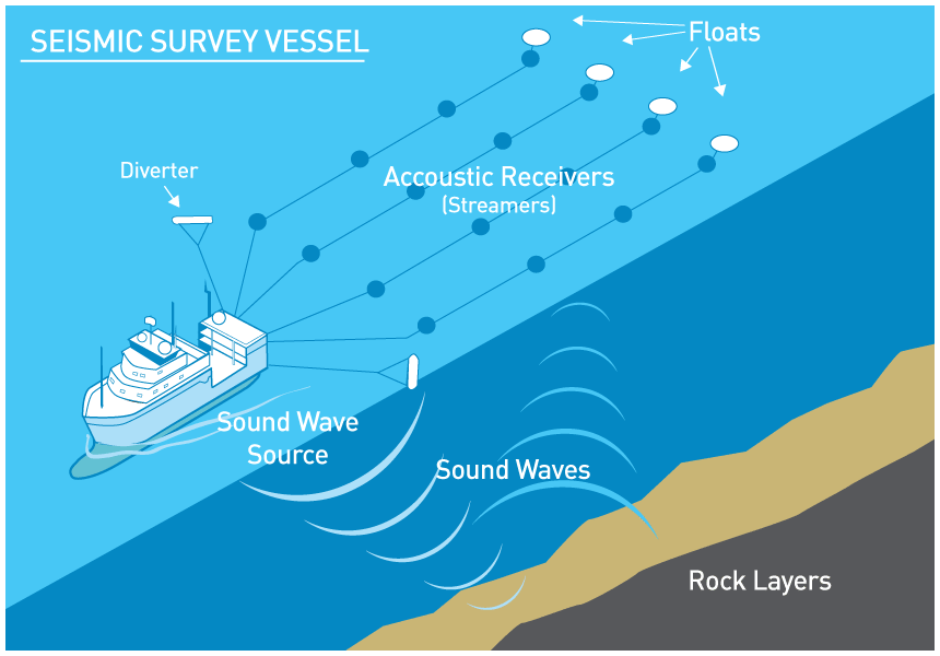
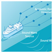
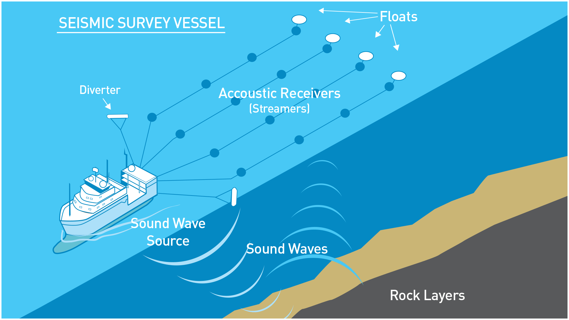 Seismic survey schematic drawing. Vector art created in Adobe Illustrator.
 Technical infographic: Strength Testing Improves PG&E Gas Pipeline Safety.
 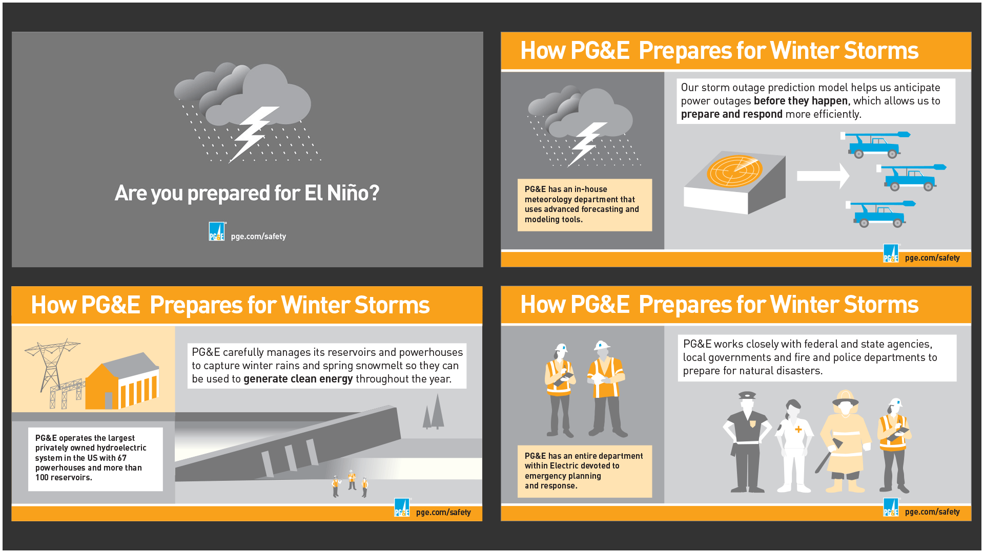 How PG&E Prepares for Winter Storms. (Media campaign.)
Pictures are not only worth a thousand words, they can also make clearer what pure numbers can’t do alone. Here are some samples of data visualization, technical drawings and infographics for various publications.
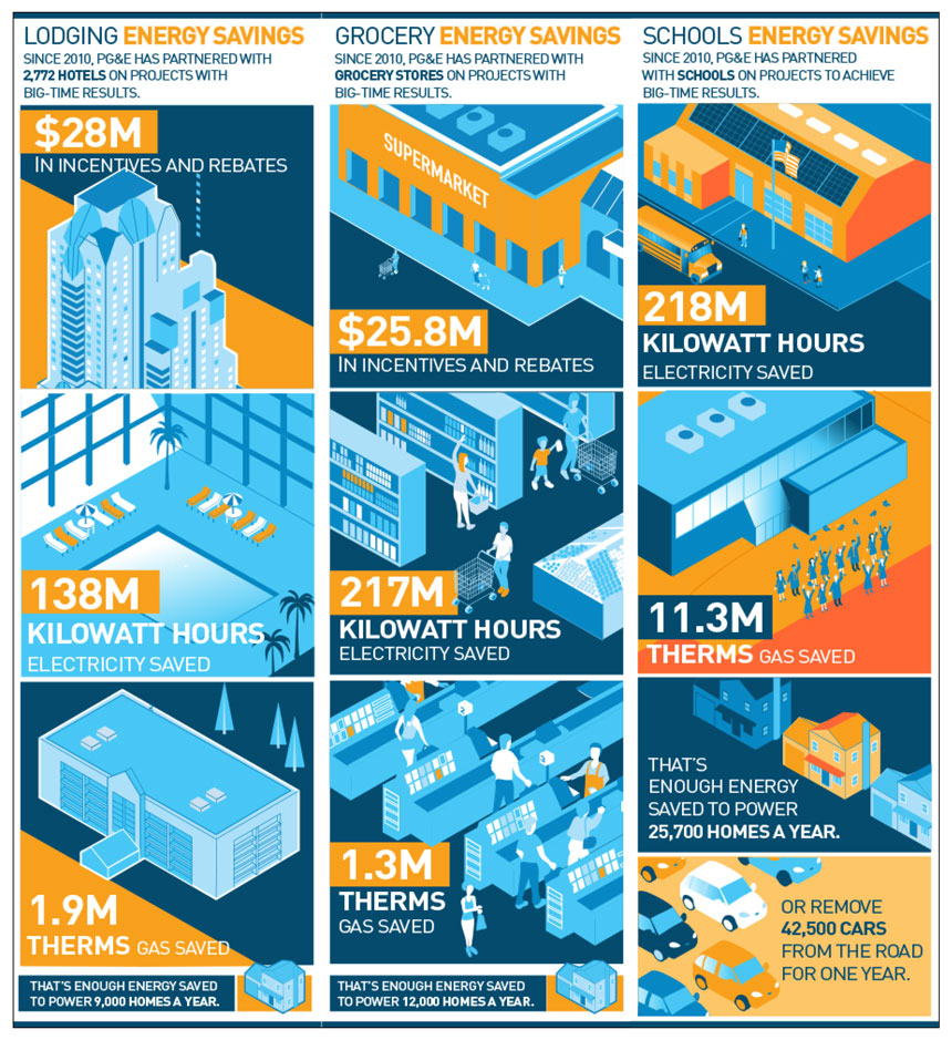 Illustrated infographic series on PG&E’s partnership with customers by industry. The PG&E color palette has been revised to meet ADA compliance.
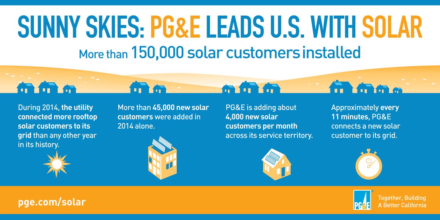
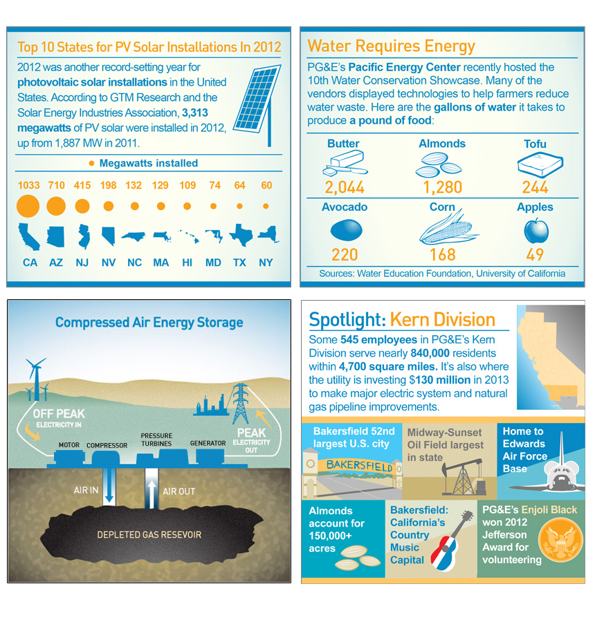 Selected infographics from PG&E. Top left: A comparative chart of solar voltaic installations by state. Top right: Water requirements for growing types of food. Bottom right: Spotlight on PG&E’s service territory regions. Bottom left: A schematic view of Compressed Air Energy Storage. This new technology captures low-cost renewable energy during off-peak times and distributes during periods of high demand.